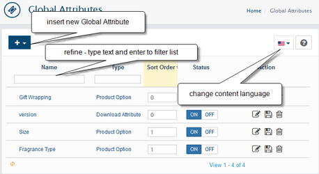
If most of your products have the same product option, you can define this option here. You will need to define the product option only once and then you will be able to add it to any product in one click (without a necessity to add option variants for each product one by one).
- Global Attributes type Product Option patterns created on this page will be available to add to products on the Administration → Catalog → Products → Options Tab
- type Download Attributes created on this page will be available for adding to products downloads on the Administration → Catalog → Products → Files Tab and when create/edit Shared Downloads on the Administration → Catalog → Downloads
- To add a new Global Attribute click the + button
| Info |
|---|
third party extensions can add more Global Attribute Types for more specific use. For example product features, order attributes, customer attributes. |
Edit Global Attribute
Global Attribute Status: MUST be "ON" for product to appear in your store.
Name: The Global Attribute's name as it will appear in the front-end.
Attribute Parent: Here you can set the Attribute you are currently adding to be a parent of another Global Attribute
| Info |
|---|
If this is a parent attribute with children attributes, it can only be of type SelectBox, MultiSelect Box, Checkbox and Checkbox group. Children values combination will be shown as one set. |
Sort Order: Sort Order set's the order of which the Global Attribute will be displayed amongst others.
Required: Select if You want to make Global Attribute required by default
Regular Expression Pattern for Validation of Values: is a sequence of characters that forms a pattern, mainly for use in pattern matching. Programming knowledge required!
Error Message of invalid Value: message text shown showed when attribute value does not meet Regular Expression Pattern
Element Type: Select the Element Type. The following types available:
| Tip |
|---|
Element Types have additional settings displayed after you choose proper element type. |
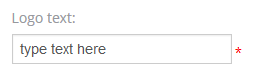
Input
a The single-line text input field. Can be used if you need require some short text from the customer for . For example cup-prints with custom names, Logos or anything else.
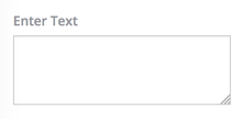
Textarea
a The multi-line text input control can hold an unlimited large number of characters. Similar to input useful for products like Wrapped Canvas.
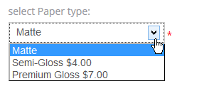
Selectbox
a The drop-down list with of options. Example colors, sizes, paper types... etc.
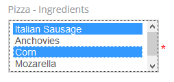
Multiselectbox
The list that allows multiple selections. Use it if you sell products that come in different sizes, colours colors or flavors. For example 2 tone color prints or food ingredients.
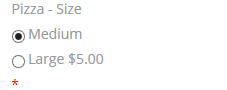
Radio
represents Represents a selection of one item from a list of items (a radio button). Similar to selectbox but displayed in other another format - all option values visible. For example "Format: Blu-ray/DVD". You able to set the default value.

Checkbox
Creates a single input checkbox. Represents a state or option that can be toggled. For example "gift wrapping: Yes".
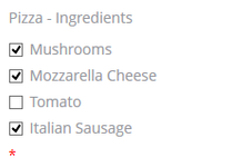
Checkboxgroup
a A multi checkbox set, allowing a user to select multiple options. Similar to multiselectboxthe multi-select box. Use it if you sell products that come in different sizes, colours colors or flavors.
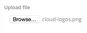
File
(File uploads can be added to attributesas attribute) - Defines a file-select field and a "Browse..." button (for file uploads). For example, a customer can send custom design or some docs attached to the ordered product.

Hidden
Defines a hidden input field (a value that is not intended to be examined or manipulated by customer)
Label
for display only purpose
| Tip | ||
|---|---|---|
| ||
You can also create an multi option to combine two options into one. See Parent & Child example |